Veritas Property Developments
A new build from their company profile and their own logo artwork. Thirty pages out of one document.
The live site
- PROFILE VERBATIM
- CONTRAST MEASURED
- 26 LINKS MAPPED
- LOGO UNTOUCHED
- OVERFLOW SWEPT
- SHIPPED
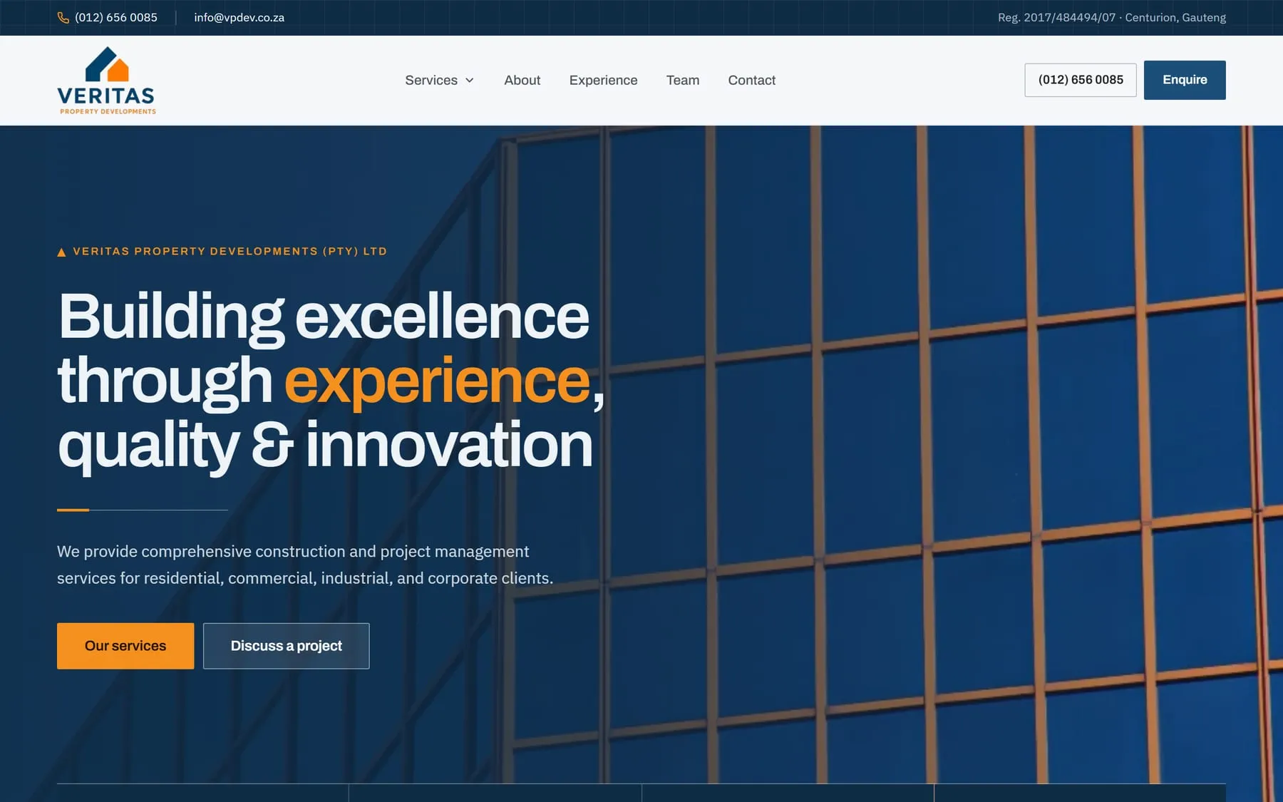
Veritas Property Developments build and project-manage. They came with a company profile document and their own logo artwork. I built the site out of the profile: 30 pages, live on Google Cloud Run in europe-west1, served by nginx from a container.
Before designing anything, I measured their colours. Navy #1B4F7A measures 8.59:1, so navy carries the text. Their logo orange #F5901E measures 2.36:1 — well under the readable line — so it became a fill-only token and never appears as a word. Where an orange word was needed, burnt orange #A44A22 at 5.86:1 does the job. Archivo and IBM Plex Sans, both self-hosted through Fontsource. A 2px corner radius throughout: square enough to read as a construction firm rather than an app.
Thirty pages needs real navigation. The top nav opens a three-column mega menu carrying 26 links, so the services are named in the nav rather than hidden one level down. The brand texture — a chevron notch and a blueprint grid — is drawn with clip-path in CSS instead of exported as image files, so it stays sharp at any size and ships as part of the stylesheet.
The words are theirs. 20 service names, 18 project-experience items and both directors' details, reproduced verbatim from the profile — nothing reworded, nothing 'improved'. Then I checked the built site rather than trusting the source: headless Chrome driven by Puppeteer at 320, 390, 768 and 1440 to catch horizontal overflow, and pixel-sampling the real rendered backgrounds to confirm the contrast ratios above. Astro 5, Tailwind CSS 4, vanilla JavaScript. No UI framework.
Calls I made
- 01
Every word of their profile, reproduced verbatim
Their company profile lists 20 service names, 18 project-experience items and both directors' details. Those are the words the firm has to stand behind — 'tightening' a service name quietly changes what it is claiming it does. So I reproduced all of it word for word and designed around the copy instead of editing the copy to fit the design.
- 02
Their logo orange never becomes a word
I measured the logo orange #F5901E at 2.36:1. That is not a readable text colour, so it is a fill-only token — panels, rules, the chevron notch — and never a letter. Where an orange word was genuinely needed I used burnt orange #A44A22 at 5.86:1, with navy #1B4F7A at 8.59:1 doing the body text. Same brand, nothing anyone has to squint at.
- 03
A 26-link mega menu, not a tidy five-item nav
Thirty pages will not fit in a small nav bar without burying most of them two clicks deep. A buyer arrives looking for one specific service and should not have to work out which landing page hides it. So the top nav opens a three-column mega menu carrying 26 links, named on screen in the nav itself.
- 04
The logo stayed exactly as supplied
They gave me their own logo artwork, so I left the colours precisely as they came rather than nudging them to suit my palette. The dark footer needed a mark that would not disappear, so I used their white-plate version there instead of recolouring the logo. The palette bends around the logo; the logo does not bend around the site.
Outcome
A live 30-page site at veritas-property-developments-u5rriq3m6q-ew.a.run.app. All 20 services, 18 project-experience items and both directors' details worded exactly as their own profile words them. Navy text at 8.59:1, logo orange restricted to fills, burnt orange at 5.86:1 for orange type, logo colours as supplied. Checked in headless Chrome for horizontal overflow at 320, 390, 768 and 1440.