Skip to content
Live Revamp · Plumbing

Wilton Plumbing

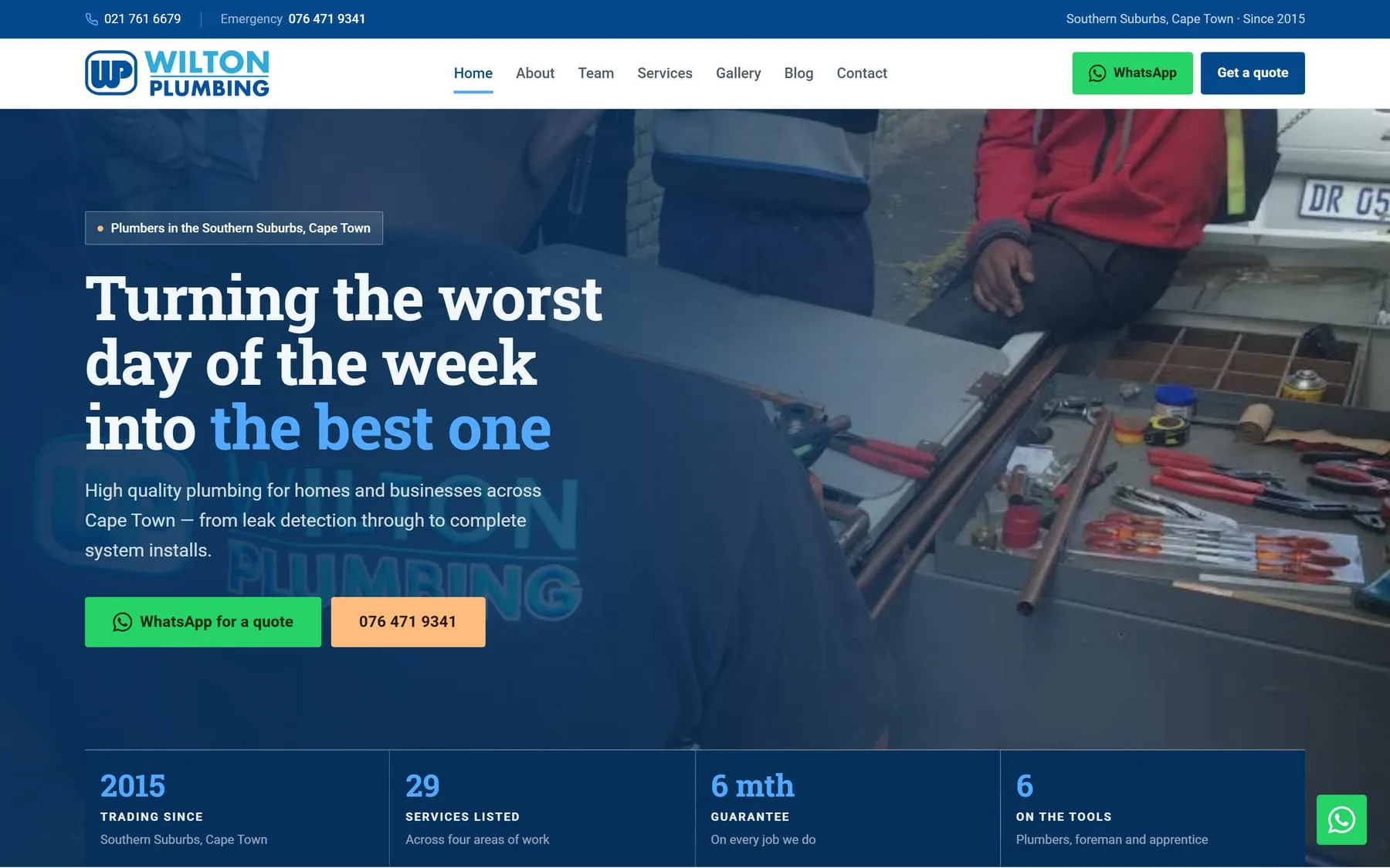
A revamp of an existing plumbing site. Keep the brand they already own; rebuild everything under it.

The Wilton Plumbing website

The live site

  • BRAND MEASURED
  • PEACH DEMOTED
  • FAQS MERGED
  • FORM MATCHED
  • OVERFLOW SWEPT
  • SHIPPED

Wilton Plumbing already had a site. This was a rebuild, not an invention: same business, same brand, the same work they actually do. I did not redesign their identity. I measured it first, then designed with what the measurements allowed.

Their peach, #FFBC7D, was being used as body text on the old site. I measured it at 1.65:1. That is not "low contrast" — that is invisible. The words were on the page and nobody could read them. Their navy, #05498C, measured 8.98:1. So navy took every word on the new site, and the peach was demoted to an urgency fill: the thing your eye lands on before it reads anything. Same two colours the client already owned. Different jobs.

The old site scattered FAQs across pages, a different set each time, and they did not agree with each other. I read the lot and consolidated them into one global five-question FAQ, answered once. The contact form got the same treatment in reverse: instead of padding it out, I matched the fields exactly to what they actually collect. The site carries a WhatsApp widget built on WhatsApp's own logo geometry rather than a redrawn approximation, because a plumber gets hired by the person who can be reached first.

It is a static Astro 5 site — Tailwind CSS 4, vanilla JavaScript, no UI framework, fonts self-hosted, images run through sharp. It is deployed to Google Cloud Run in europe-west1 and served by nginx from a container. I drove the built output with headless Chrome: swept for horizontal overflow at 320, 390, 768 and 1440 pixels, and pixel-sampled the rendered backgrounds to confirm the contrast ratios matched what the design claimed. I check the built site, not the source. The source is an opinion.

Judgement

Calls I made

  • 01

    The peach was body text at 1.65:1. Now it is a fill.

    Their peach #FFBC7D was carrying body copy on the old site. I measured it at 1.65:1 — technically printed, effectively invisible. Their navy #05498C measured 8.98:1, so navy took every word and the peach became an urgency fill only: nothing a customer has to read to get a phone number.

  • 02

    One FAQ for the whole site, not one per page

    The old site scattered FAQs across pages, a different set on each, and the answers contradicted one another. I read all of them, cut the overlap and consolidated them into a single global five-question FAQ. Five answers to maintain instead of a set per page, and no two pages telling the same customer two different things.

  • 03

    The form asks only for what they actually collect

    Contact forms get padded with fields that look thorough — company name, budget range, how did you hear about us — and then nobody reads the answers. I matched Wilton's form field for field to what they actually collect. Nothing on it is decoration.

  • 04

    I verify the built site, not the source code

    A design token is a promise. A rendered pixel is a fact. I drove the built output with headless Chrome, pixel-sampled the real backgrounds to confirm the navy was landing at its measured 8.98:1, and swept for horizontal overflow at 320, 390, 768 and 1440 pixels. A site that scrolls sideways is the fastest way to look broken to someone standing in a flooded kitchen on a phone.

Outcome

Eight pages live on Google Cloud Run at wilton-plumbing-u5rriq3m6q-ew.a.run.app. Every word set in navy at 8.98:1, the peach kept as a highlight only, one five-question FAQ instead of a set per page, a contact form matched field for field to what they collect, and a WhatsApp widget drawn on WhatsApp's own logo geometry. The same brand they walked in with — used properly.