

Measure the brand colour before you design with it
Bright brand colours almost always fail as text — here are the measured numbers from five builds, and the two-token fix that keeps the client's colour on the page.
- accessibility
- colour
- design-systems
Wilton Plumbing’s old site set body copy in their brand peach, #FFBC7D, on white. That measures 1.65:1. The floor for body text is 4.5:1. So the words were technically on the page and practically not: paragraphs of plumbing detail that a customer on a phone in daylight could not read at all.
Nobody chose that. It happens the way it usually happens. A colour is the brand colour, so it becomes a text colour too, and nobody puts a number on it first.
That is the whole job. Put a number on the colour before you design with it.
The measurement comes first, then the layout
On all five of the builds below, the first thing I do after getting the client’s brand is run every hex code against every ground it might sit on, and write the ratios down. Before any layout. Before any font decision.
The results are boringly consistent. Bright brand colours fail as text.
- Solar DNA’s orange,
#FE9700: 2.18:1 on white. - Veritas Property Developments’ logo orange,
#F5901E: 2.36:1. - Wilton’s peach,
#FFBC7D: 1.65:1.
Three different companies, three different industries, same failure. And it makes sense — these colours were picked for a logo, where they sit at large sizes as shapes, not as sentences. A logo mark at 1.65:1 is a design choice. A paragraph at 1.65:1 is a bug.
The mistake is treating “the brand orange” as one thing with one job.
Split the colour into two tokens
The fix is not to abandon the client’s colour. Clients are right to be protective of it. The fix is to stop asking one hex code to do two incompatible jobs.
Every brand colour that fails becomes two tokens: a fill token, used only as a background, a bar, a rule, an icon, an underline — anywhere the colour is a shape; and a text-safe sibling, a darker version of the same hue, used any time the colour has to become a word.
The shape of it, with Solar DNA’s numbers:
--fill: #FE9700;  /* 2.18:1 — shapes only, never a word */
--ink:  #AB6600;  /* 4.53:1 on white — words */
Veritas got the same treatment: #F5901E restricted to fills, with a burnt orange #A44A22 at 5.86:1 carrying any orange word, and the navy #1B4F7A at 8.59:1 doing the actual reading work. Wilton’s navy #05498C measures 8.98:1, so it takes the body copy, and the peach became an urgency fill — the thing your eye lands on, not the thing you read.
The client still sees their brand on the page — used where it is strong, instead of where it fails.
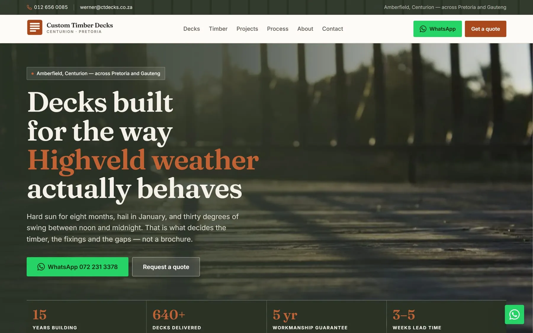
Occasionally a colour does both jobs. The rust I chose for a timber decking build, #A8481C, measures 5.82:1 against white — and because contrast is symmetric, white text on a rust panel is also 5.82:1. One token, two jobs, no sibling needed. That is a lucky hex code, not a normal one.
The same colour is two different colours on two grounds
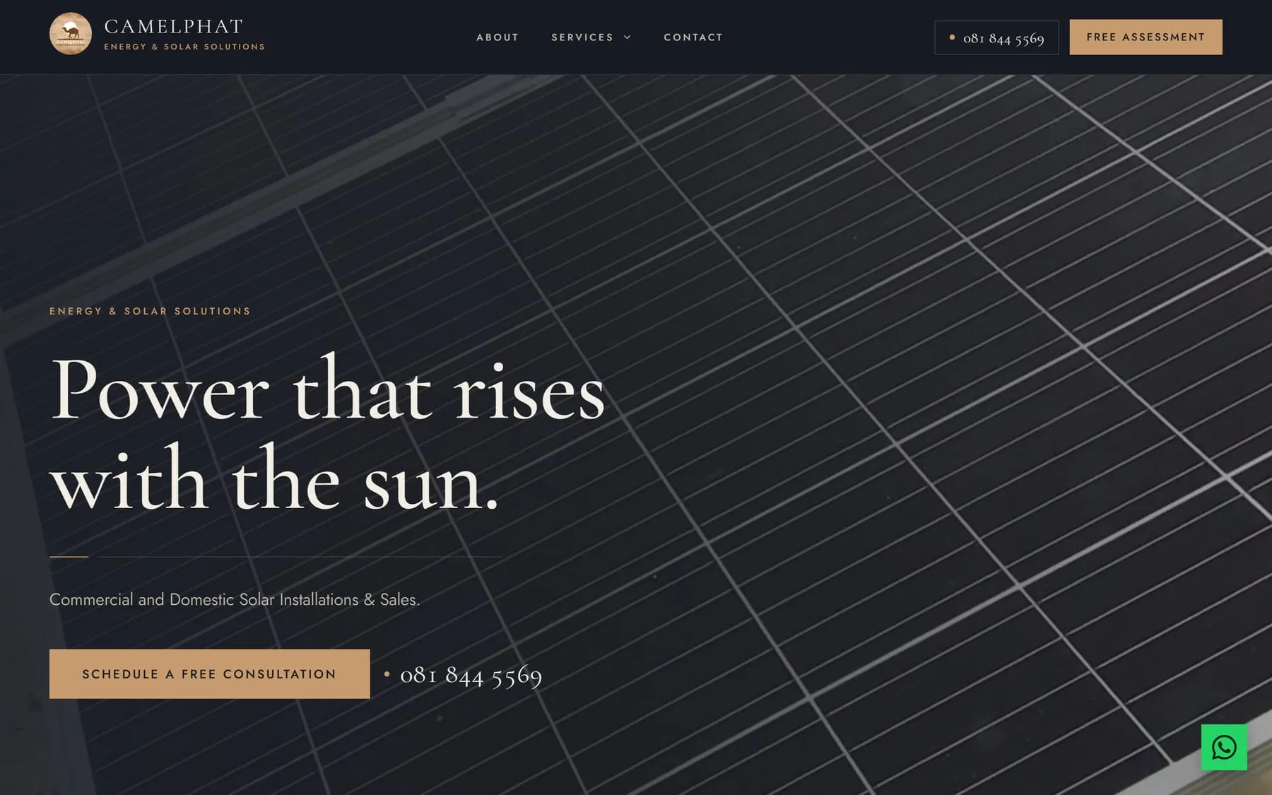
Camelphat Energy runs a two-ground design system: night #171B22 and sand #D9CDB8. Same brand, same tan accent #C89B6E throughout.
That tan measures 6.59:1 on the night ground. On sand it measures 1.60:1.
Near-exact opposites, from one hex code. So “is this accent readable?” has no answer on its own — it only has an answer paired with a ground. Every ink token on that site got measured separately per ground, and the accent swaps when the ground swaps. If you build a light mode and a dark mode from one palette and only test one of them, this is the failure you ship.
A video hero is not one ground, it is thousands
The same site has a video hero. Text over moving footage is the hardest version of this problem, because the ground is different in every frame.
The honest test is not the poster frame, and not an average — it is the worst frame. I stepped through the clip and found it: bright aluminium rails sweeping across, dropping the lead paragraph to 1.07:1. Effectively white on white, on the frames where those rails cross the text.
Fixed with a brightness floor on the video plus a scrim that changes axis at 1024px. Measured against that worst frame: 11.2:1 on the headline, 6.8:1 on the lead paragraph on mobile.
Measure the rendered pixel, not the token
Tokens lie. A colour that passes in your palette file can fail on the page because something sits between them — an overlay, an image, an opacity, a parent background you forgot about.
So I verify in the built output, not the source. Headless Chrome via Puppeteer loads the real pages, samples the actual rendered pixels behind the text, and computes the ratio from what is on screen. Same run checks for horizontal overflow at 320, 390, 768 and 1440.
That is how the breadcrumbs on Camelphat got caught. Seven page heroes, breadcrumb links measured 1.49:1 against the real rendered backgrounds. Now 5.04:1.
What this costs
One pass with a contrast checker at the start of a build, and one extra token per failing colour.
Against that: nobody has to argue with the client later about why their orange is being “changed”, because it is not being changed — it is being given a job it can do. And no customer opens the site to a paragraph they cannot read.
Put the number on the colour first. Everything downstream gets easier.